
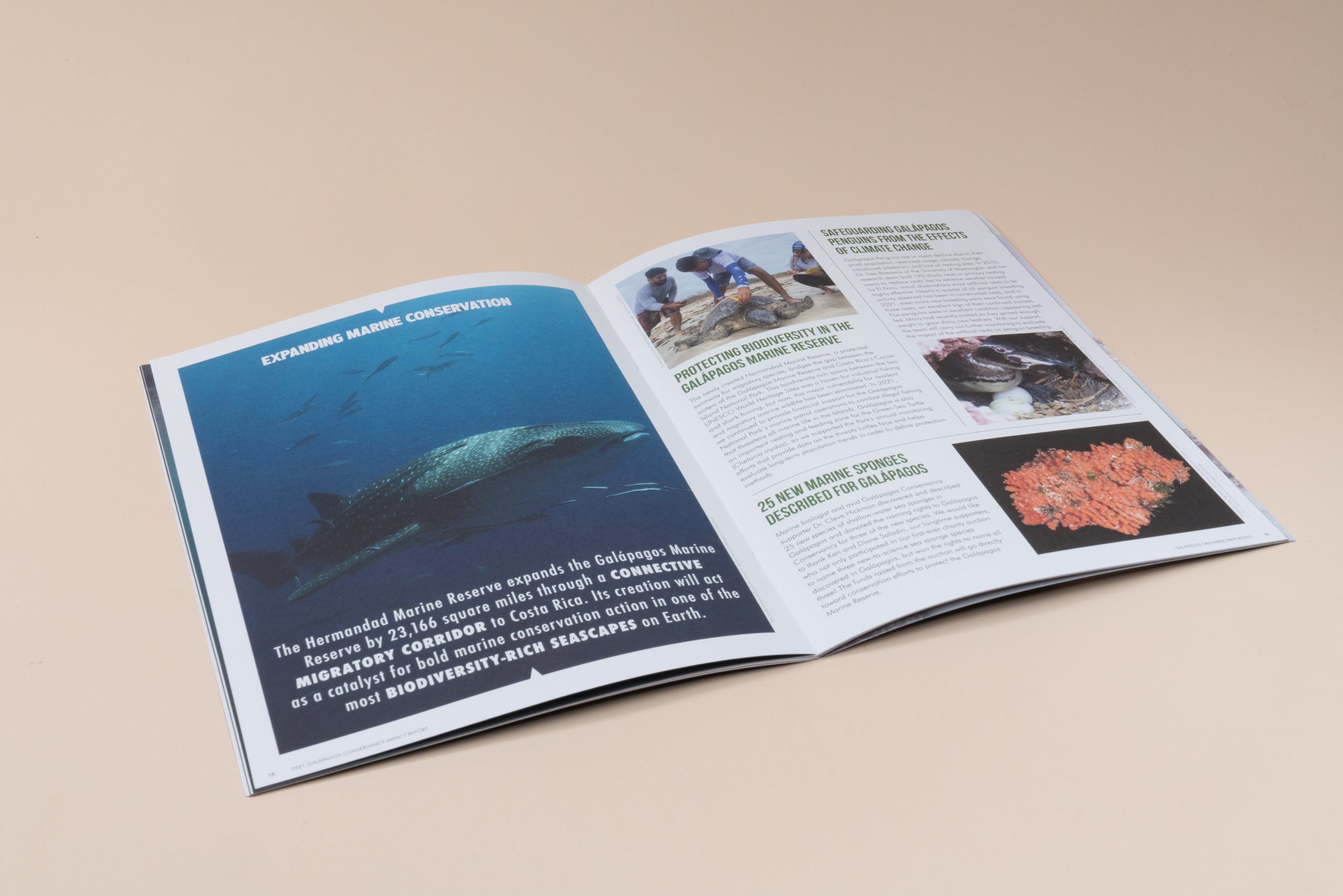
Tips For Magazine Printing: A Practical, Sustainable Guide
A well-produced magazine gives your content weight – literally and figuratively. It’s a portable format for case studies, product features, and brand education. If you’re planning to print a magazine, the choices you make in layout, paper, binding, and color will shape quality and cost. This guide offers clear steps to approach magazine printing with confidence and a lighter footprint.
Magazine printing covers the path from design files to finished copies: prepress checks, paper selection, ink on press, binding, and finishing. Let’s start with your design.
What’s the Most Important Element of Magazine Layout Design?
Clear visual hierarchy. It answers a simple question for your reader: What do I look at first, next, and last? When hierarchy is strong, pages feel organized, reading is easier, and your message lands. Here are tips to help you master visual hierarchy:
- Set one focal point per spread. A headline or hero image should lead; avoid competing anchors.
- Lean on white space. Space around headlines, images, and columns guides the eye and reduces fatigue.
- Stay consistent. Define paragraph and character styles for headlines, decks, body, captions, and pull quotes; repeat them across the issue.
- Align with a grid. Columns, baselines, and consistent gutters create an easy reading path.
Design With White Space
White space is not wasted space – it’s a tool. It improves legibility, reduces eye fatigue, and adds polish. Give headlines, subheads, and images room to breathe. Keep key content within a clear grid, and avoid cramming elements near the trim or gutter. The result is a layout that reads cleanly and feels premium.
Choose The Right Paper
Start with how the magazine will be used. Who will read this? How will they use it: kept on a desk, handed out at events, or mailed? Your answers will point you toward the right coating and paper weight choices.
What Is the Best Paper to Print a Magazine On?
Short answer: there isn’t one “best” paper for every magazine. The right choice depends on your content mix (text vs. photography), desired look and feel, durability needs, mailing weight, and sustainability goals. Here’s a practical guide to help you pick confidently.
Understand Your Main Paper Types
Paper choice shapes how your magazine feels in hand, how images reproduce, and how pages wear over time. Use this quick comparison to match each finish to your content, brand, and sustainability goals.
Uncoated paper has a natural, tactile feel without glare, giving colors a softer appearance and slightly lower saturation because the ink absorbs into the fibers. It’s often chosen for its comfortable readability and premium editorial style, and it offers strong recycled content options.
Pros:
- Excellent readability
- Premium editorial feel
- Strong recycled options
Considerations:
- Images print more softly
- Scuffing can occur with heavy ink coverage
Silk or matte coated paper is smooth with a low sheen, providing clean detail and controlled saturation while minimizing glare and fingerprints. It’s a versatile choice for layouts with both text and images, delivering a professional and modern appearance.
Pros:
- Great all-rounder for mixed text and images
- Professional, modern look
- Reduced glare and fingerprints
Considerations:
- Minor scuffs can appear
- Light coating recommended for better rub-resistance
Gloss coated paper features a shiny, slick surface that maximizes detail and produces high-impact color, making it well-suited for image-heavy designs and product photography.
Pros:
- Maximum detail and high color pop
- Strong choice for image-driven layouts
Considerations:
- Can create glare in bright light
- Fingerprints more noticeable
Only Use High-Quality Images
Your images set the tone for the whole piece. Starting with clean, well-lit photos gives your pages a polished, professional feel with less work down the line. Your magazine looks its best when you start with strong source files.
- Supply images at 300 ppi at final print size (add 0.125″ bleed if the image runs to the edge).
- Avoid upscaling. Favor original captures or RAW exports over screenshots.
- Choose in-focus photography with even lighting and natural skin tones.
- For the cover, pick one clear, on-theme image that invites the first page turn and holds up at large scale.
Prepare Color And File Settings For Print
A little care in prepress pays off. Set up your files so color behaves the way you expect on paper and your type stays crisp.
- Export to CMYK and embed the recommended ICC profile.
- Use spot colors only where they’re part of your brand system.
- For large black areas, apply a printer-recommended rich black for depth and smooth coverage.
- Keep total ink within advised limits, and embed or outline fonts on export so text prints cleanly.
Set Bleeds, Margins, And Safe Areas
Think of these as safety nets for your layout. Bleeds, margins, and safe areas keep headlines, logos, and photos right where you intend after trimming and binding. These settings protect your layout on press and during trimming.
- Bleed: Extend backgrounds and images 0.125″ beyond the trim on all sides.
- Safe Area: Keep logos and key text 0.25″–0.5″ inside the trim.
- Gutter: For perfect-bound magazine printing, add extra inner margin so crossovers don’t disappear into the spine.
Proofread Before You Send To Print
A brief pause to review can save time, materials, and reputation. Give your pages a careful read so the final piece reflects your best work.
A careful review supports credibility. Read the full piece front to back, then back to front for a fresh view. Confirm page numbers, captions, callouts, credits, and URLs. Check running heads and any cross-references. A second set of eyes often spots issues you might miss.
Request A Proof
A proof offers reassurance. It lets you see how content, color, and finishing come together before you commit to the full run. Proofs help you confirm content, color, and finishing before production.
- Soft Proof: A calibrated PDF review for layout, bleeds, and page order, plus an initial read on color.
- Hard Copy Proof: Printed on your chosen stock for an accurate view of color, sharpness, coating, glare, and rub-resistance – especially useful for photography and brand tones.
Our Best Tip: Use A High-Quality, Professional Printer
Our experienced production team will flag issues early, recommend paper weights that hold ink well without excess show-through, and help you weigh trade-offs between coating, glare, and fingerprints. When looking for the right magazine printing services, prioritize sustainable practices, color-managed workflows, and clear guidance on binding and finishing.
Ready to bring your project to life? Greenerprinter offers a full range of sustainable printing options. Explore some of our most popular products:
Book & Booklet Printing
Custom Book Printing | Custom Booklet Printing | Saddle-Stitched Booklets | Zines | Catalogs | Custom Calendars