
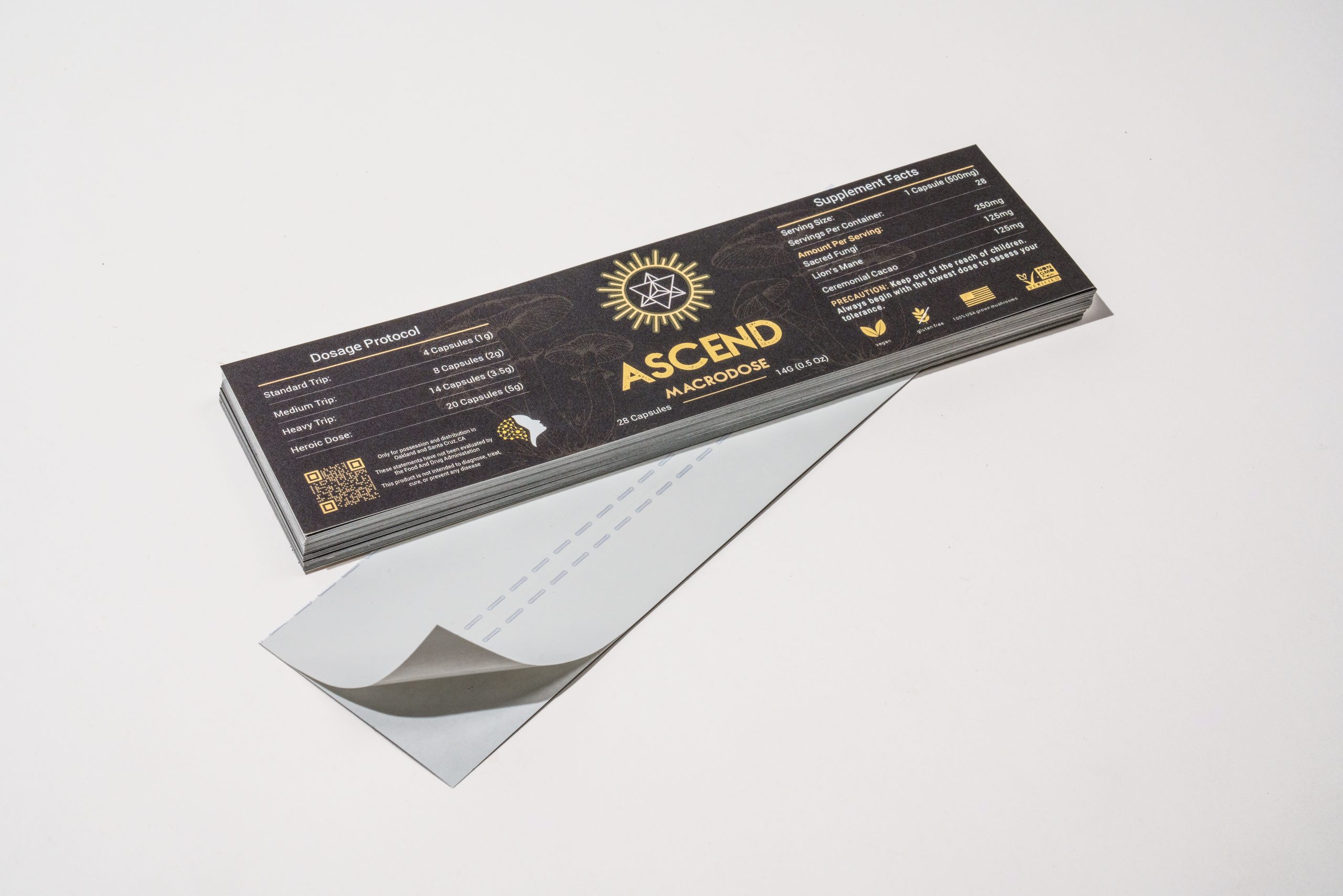
Pantone color in printing is a standardized spot color system used to help designers and printers reproduce color more accurately and consistently. Pantone gives everyone a shared color reference, so a brand color has a better chance of printing exactly the way it was intended.
Print color can shift based on ink, paper, coating, and press conditions. A color that looks right on screen may look slightly different once it’s printed – especially when screens are set in RGB, and most printers print in CMYK. Pantone helps reduce that gap by giving printers a specific color target to match.
For businesses ordering branded materials like booklet printing, custom catalog printing, packaging, or premium marketing pieces, understanding Pantone can make print decisions easier and help avoid costly color surprises.
What is a Pantone Color? What do Pantone colors mean?
A Pantone colour is a colour chosen from the Pantone Matching System, often called PMS, that is used as a precise color reference during print production.
Unlike colors built from CMYK process inks, Pantone colors are usually printed as spot colors. That means the ink is mixed to match a specific Pantone reference perfectly rather than being created on press from cyan, magenta, yellow, and black.
In practical terms, Pantone gives designers, brands, and printers a common language for color. Instead of describing a color loosely or relying on screen previews, they can point to a specific Pantone number and work from the same target.
Why Are Pantone Colors Used In Printing?
Pantone colors are used in printing because color consistency is hard to maintain without a common reference.
Printed color is affected by more than the file itself. Paper stock changes how ink appears. Coated paper can make a color look sharper or more saturated, while uncoated paper can soften it. Finishes, press setup, and production method also affect the final result.
Pantone helps control that process by giving the printer a defined color goal. That’s especially useful when:
- a logo color needs to stay consistent across several pieces
- packaging must match brand standards closely
- a project uses a color that CMYK can’t reproduce well
- the job calls for a metallic, fluorescent, or other specialty ink
For many clients, Pantone becomes most valuable when the printed piece is brand-sensitive and small color shifts would be noticeable.

What Is Special About Pantone?
Pantone is special because it gives designers, brands, and printers a standardized way to communicate color in print. Instead of describing a color loosely or relying on how it looks on a screen, everyone involved in the job can refer to the same Pantone color and work toward the same result.
Who Uses Pantone Colors?
Designers use Pantone colors when creating logos, packaging, brand systems, and print files that depend on a specific color reference.
Printers use them to match spot inks and guide production decisions.
Brand and marketing teams use Pantone colors to keep printed materials aligned across different formats, from business cards and presentation folders to product packaging and direct mail.
Pantone vs. CMYK In Printing
Pantone and CMYK are both used in print, and often used together, but they work differently. CMYK uses four process inks (cyan, magenta, yellow, and key black) to build a wide range of colors during printing. It’s the standard method for full-color pieces like brochures, postcards, catalogs, and photo-heavy marketing materials.
Pantone uses pre-mixed spot color matched to a specific Pantone reference. Instead of creating that color from four inks on press, the printer uses a dedicated ink for that one color.
Pantone is often better when exact color matching is a top priority. CMYK-only is often better when the design includes photographs, gradients, and many colors across the page.
A good rule of thumb is if your project depends on one very specific brand color looking consistent, Pantone is worth considering. If the job is full-color and image-heavy, CMYK is often the more efficient choice.
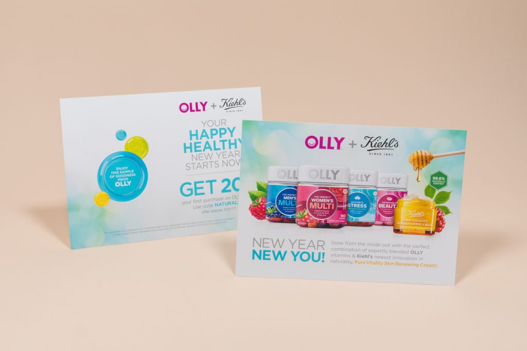
For example, this postcard could be printed as CMYK-only or, if brand consistency is important to OLLY, they could use CMYK+Spot color to ensure their logo is the exact correct shade.
What Is A Spot Color?
A spot color is a pre-mixed ink printed on its own rather than built from CMYK percentages. Pantone colors are commonly used as spot colors in commercial printing. This gives printers more control over certain hues, especially brand colors that need to stay stable across different materials and print runs.
Spot colors can also be useful for specialty effects. Metallics and fluorescents are common examples. These are hard, and sometimes impossible, to reproduce convincingly in standard CMYK printing.
How Does Paper Affect Pantone Color in Printing?
Paper has a major effect on color appearance. The same Pantone color can look noticeably different on coated and uncoated stocks because the surface changes how the ink sits and reflects light. Coated papers often produce a cleaner, crisper appearance. Uncoated papers can absorb more ink and shift the look of the color.
That’s why Pantone references are often specified by paper type. If a designer chooses a Pantone color for coated stock but the final job prints on uncoated recycled paper, the result may not look the way they expected. Color choice and paper choice should be made together.
When Should You Use Pantone Color In Printing?
Pantone makes sense when color precision matters more than flexibility.
It’s often a strong choice for logo-driven materials, high-end brand collateral, presentation folders, custom packaging, product labels, and other pieces where color consistency affects the overall impression. It can also be the better route when a business needs one signature color to stay recognizable across different print formats.
However, Pantone may not be necessary for every job.
If the project includes full-color photography, multiple gradients, or a wide range of tones, CMYK is usually the better fit. It can also be more cost-effective for many standard marketing pieces.The decision depends on the specific job, not just the file.
What Does CMYK to Pantone Mean in Printing?
CMYK to Pantone usually means finding the closest Pantone match for a color that was originally built with CMYK values.
This comes up often when a brand starts with digital or general print assets, then moves into packaging or more color-sensitive print production. A business may already have a logo defined in CMYK, but now needs a Pantone equivalent for a spot-color job.
The important thing to know is that this is not always an exact conversion.
Some CMYK colors can be matched closely. Others can only be approximated. Pantone and CMYK don’t t cover color in exactly the same way. That’s why conversion tools are useful, but they are only a starting point.
Your printer should review the actual project, stock, and production method before finalizing the color approach.
How Should Designers Prepare Pantone Colors For Print?
For designers, Pantone setup needs to be handled carefully. In Illustrator or InDesign, the Pantone color should be selected from the proper swatch library and kept as a spot color in the file. If the spot color is accidentally converted during export, the printer may not receive the Pantone information correctly.
It also helps to check that the Pantone reference matches the intended stock as closely as possible. This is a small technical detail, but it can have a real effect on the final piece. Clean file setup makes production smoother and reduces questions during prepress.
How To Choose The Right Color Method For Your Print Project
The best color method depends on what the piece needs to do.
If you’re printing a photo-rich brochure or a standard marketing piece, CMYK may be the right choice. If you need one exact brand color to stay consistent across packaging, folders, or high-end collateral, Pantone may be worth the extra control.
That decision becomes easier when it’s made with the printer, not after the file is already finished. Color method, stock, coating, and budget all shape the final outcome.
Greenerprinter helps businesses and design teams make those decisions with clarity. If you’re planning a project that depends on strong brand color, premium print quality, and environmentally responsible production, our team can help you choose the right approach before the job goes to press.

Common Questions About Pantone Color In Printing: FAQs
Is Pantone better than CMYK for printing?
Not automatically. Pantone is better for certain jobs, especially when exact brand color matching or specialty inks are required. CMYK is often better for full-color, image-heavy designs.
Do I need Pantone for every print project?
No. Many print projects work very well in CMYK. Pantone is most useful when color consistency is especially important.
Can every CMYK color be converted to Pantone?
Not perfectly. Some colors translate closely, while others only have approximate Pantone matches.
Ready to bring your project to life? Greenerprinter offers a full range of sustainable printing options. Explore some of our most popular products: